This is the second part of a three-part segment on how we use ROC analysis to help clients benchmark their diagnostic or predictive methods they may be developing.
The following are introductory slides we provide as part of every client briefing to explain to them our analytical approach, and to quickly get them up to speed on the essential metrics we will be addressing. In this case, it was necessary for us to provide a simple tutorial on ROC analysis.
Slide 1:
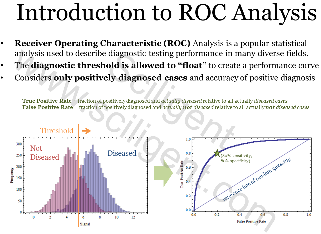
Here we introduce the client to the basic ROC curve and how it is generated from their data set, which in this case consists of a sample set of individuals that may or may not have contracted a particular disease.
Slide 2:
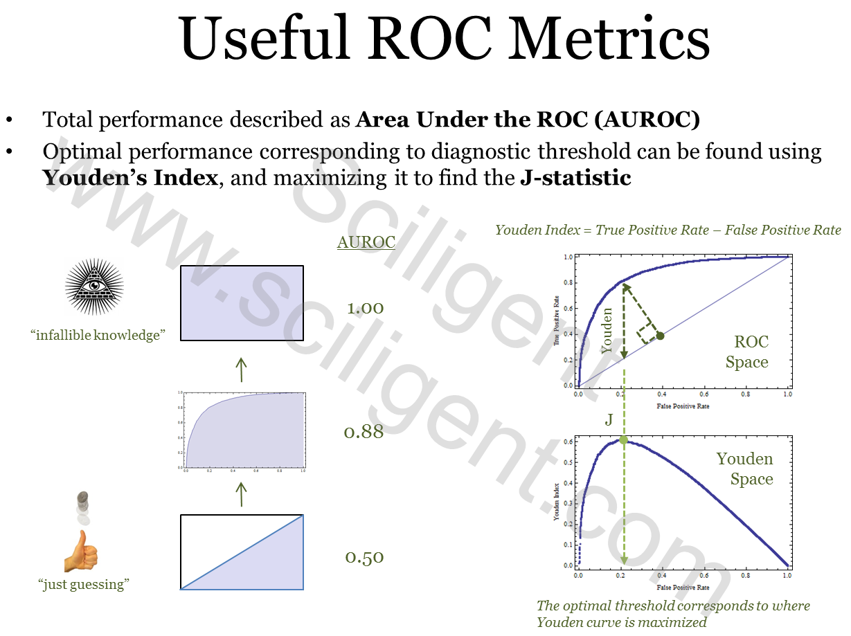
Once we have introduced a basic ROC curve, we cover the useful metrics that can be extracted from such a curve and try to give them a way to intuitively interpret what they are looking at.
Slide 3
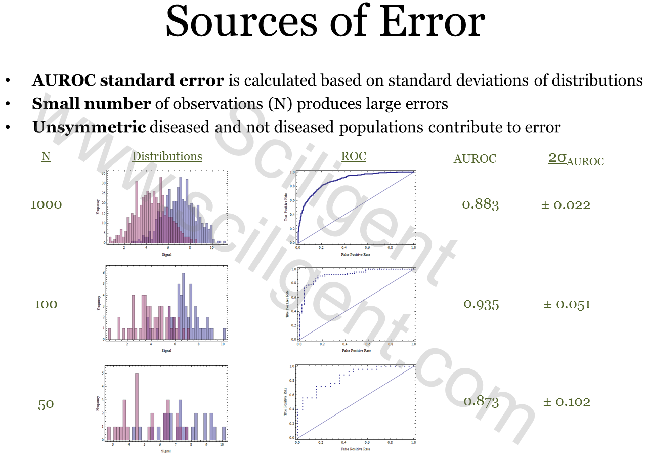
Last, in the simple tutorial we cover the major source of error in this analysis and how it varies according to the size of the sample population.
… and that covers the basic tutorial introduction that we provide for this type of analysis. Obviously we cannot show you the analysis of the actual data, so the third part of the segment will conclude with how we use these metrics and the performance curve to determine if their diagnostic meets the regulatory agency’s standards.